ngoctuanpham
about me
work
resume

Role
Role
Role
User Experience Design Intern,
User Interface
Design Intern
Product Design
Intern
User Experience Design,
User Interface Design Intern
Duration
Duration
Duration
6 weeks
Tools
Tools
Tools
Figma
Team
Team
1 UX Designer
1 Project Manager
1 Product Owner
3 Developers
About dentsu
About dentsu
About dentsu
Dentsu, headquartered in Tokyo, Japan, is a leading global advertising and marketing services company, founded in 1901, known for its innovative approach and expanding global presence.
Dentsu, headquartered in Tokyo, Japan, is a leading global advertising and marketing services company, founded in 1901, known for its innovative approach and expanding global presence.
Dentsu, headquartered in Tokyo, Japan, is a leading global advertising and marketing services company, founded in 1901, known for its innovative approach and expanding global presence.
About Eagle
About Eagle
About Eagle
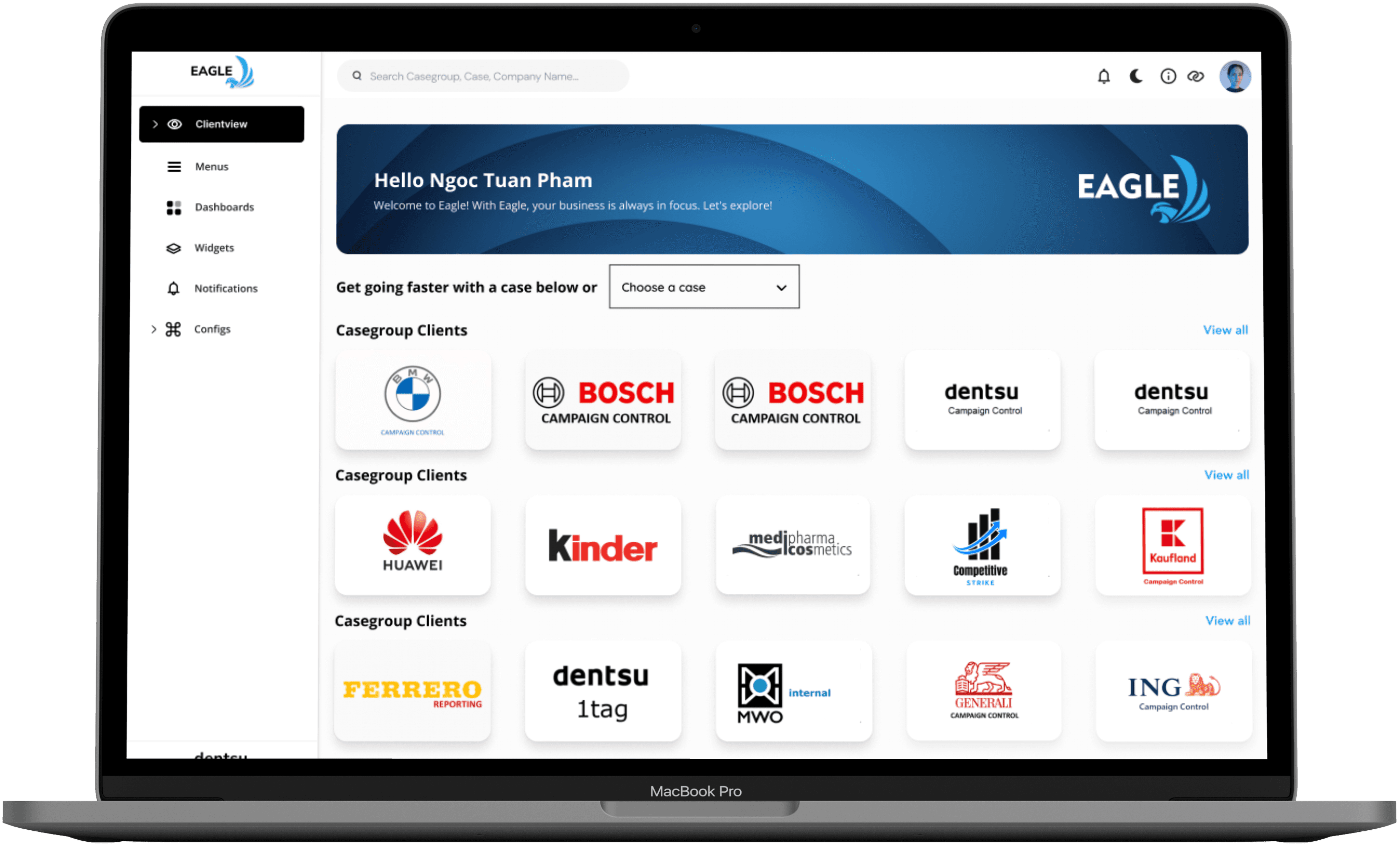
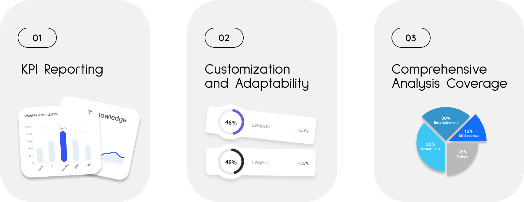
EAGLE, Dentsu Germany's reporting tool, provides web-based business intelligence for instant KPI reporting, customizable to client needs. It interfaces with third-party networks and Dentsu's systems, ensuring secure cloud-based storage and modular options for diverse analysis.
EAGLE, Dentsu Germany's reporting tool, provides web-based business intelligence for instant KPI reporting, customizable to client needs. It interfaces with third-party networks and Dentsu's systems, ensuring secure cloud-based storage and modular options for diverse analysis.
EAGLE, Dentsu Germany's reporting tool, provides web-based business intelligence for instant KPI reporting, customizable to client needs. It interfaces with third-party networks and Dentsu's systems, ensuring secure cloud-based storage and modular options for diverse analysis.


Design
Approach
Design
Approach
Design Approach


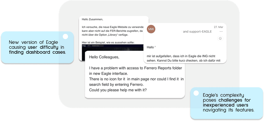
Unwanted Emails from Colleagues
Unwanted Emails from Colleagues
Unwanted Emails from Colleagues


Research Process
Research Process
Research Process
01
Interviews
Interviews
Discovering Pain Points
2 Interviewees
02
Personas
Personas
Empathizing
2 typical Users
03
Journey Mapping
Journey Mapping
Synthesizing Insights from 2 User Journeys
04
Competitor Analysis
Competitor Analysis
Conduct 4 Competitor Analyses Cases
Understanding
Problem Space
Understanding
Problem Space
Understanding Problem Space
Our product grapples with usability challenges, particularly in navigation complexity and discoverability. Users struggle to find key features due to unclear paths, hindering productivity and frustrating their experience
Our product grapples with usability challenges, particularly in navigation complexity and discoverability. Users struggle to find key features due to unclear paths, hindering productivity and frustrating their experience
Our product grapples with usability challenges, particularly in navigation complexity and discoverability. Users struggle to find key features due to unclear paths, hindering productivity and frustrating their experience
Complex
Navigation
Complex
Navigation
After the testing sessions, I found that users struggle to find their way around the screen because there are no obvious navigation elements or cues indicating where to go next.
After the testing sessions, I found that users struggle to find their way around the screen because there are no obvious navigation elements or cues indicating where to go next.
After the testing sessions, I found that users struggle to find their way around the screen because there are no obvious navigation elements or cues indicating where to go next.
Disorganized content
Disorganized content
Content isn't organized in a logical or intuitive manner, users struggle to navigate and find what they need. This can lead to frustration and inefficiency in completing tasks.
Content isn't organized in a logical or intuitive manner, users struggle to navigate and find what they need. This can lead to frustration and inefficiency in completing tasks.
Content isn't organized in a logical or intuitive manner, users struggle to navigate and find what they need. This can lead to frustration and inefficiency in completing tasks.
Lack of visual hierarchy
Lack of visual hierarchy
Testing revealed user confusion about the product's functionality, with many application sections lacking clear hierarchy visually and informationally, making form completion difficult.
Testing revealed user confusion about the product's functionality, with many application sections lacking clear hierarchy visually and informationally, making form completion difficult.
Testing revealed user confusion about the product's functionality, with many application sections lacking clear hierarchy visually and informationally, making form completion difficult.
Limited
Discoverability
Limited
Discoverability
Some features were buried within menus or interfaces, making them hard for users to discover. This can result in users missing out on valuable functionality simply because they're unaware it exists.
Some features were buried within menus or interfaces, making them hard for users to discover. This can result in users missing out on valuable functionality simply because they're unaware it exists.
Some features were buried within menus or interfaces, making them hard for users to discover. This can result in users missing out on valuable functionality simply because they're unaware it exists.
Introduction:
Structure of
Eagle model
Introduction: Structure of Eagle model
Introduction: Structure
of Eagle model
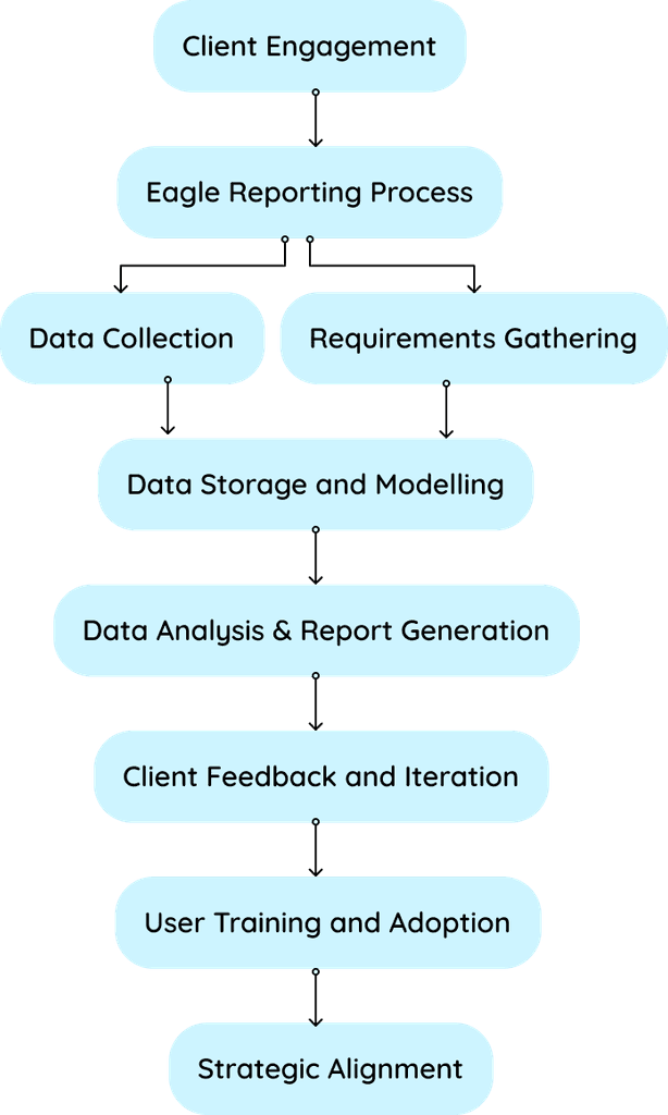
Reporting involves multiple step processes including extracting and transforming data, enabling analysis and visualization to create informative reports. Users design and generate reports, distribute them to stakeholders, and monitor performance. This process facilitates data-driven decision-making, supports collaboration, and ensures timely insights for achieving organizational goals.
Understanding the Eagle structure model gives me a solid understanding of how Eagle functions. It's pivotal in my design process, helping me discern what users truly need when interacting with a product.


Who are we designing for
Who are we designing for
Who are we designing for
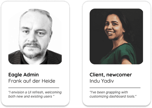
Having the opportunity to work with Eagle, I've noticed two main types of users:
Eagle Admins and clients (or colleagues from different teams who have not used Eagle before)
Having the opportunity to work with Eagle, I've noticed two main types of users:
Eagle Admins and clients (or colleagues from different teams who have not used Eagle before)
Having the opportunity to work with Eagle, I've noticed two main types of users:
Eagle Admins and clients (or colleagues from different teams who have not used Eagle before)

User Journey Mapping
User Journey Mapping
User Journey Mapping
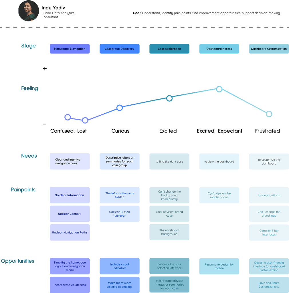
By thoroughly mapping users' needs, pain points, and opportunities during the onboarding process, our team took a more holistic approach to evaluating design features
By thoroughly mapping users' needs, pain points, and opportunities during the onboarding process, our team took a more holistic approach to evaluating design features


Standing on the shoulders of giants
Standing on the shoulders of giants
Standing on the shoulders of giants
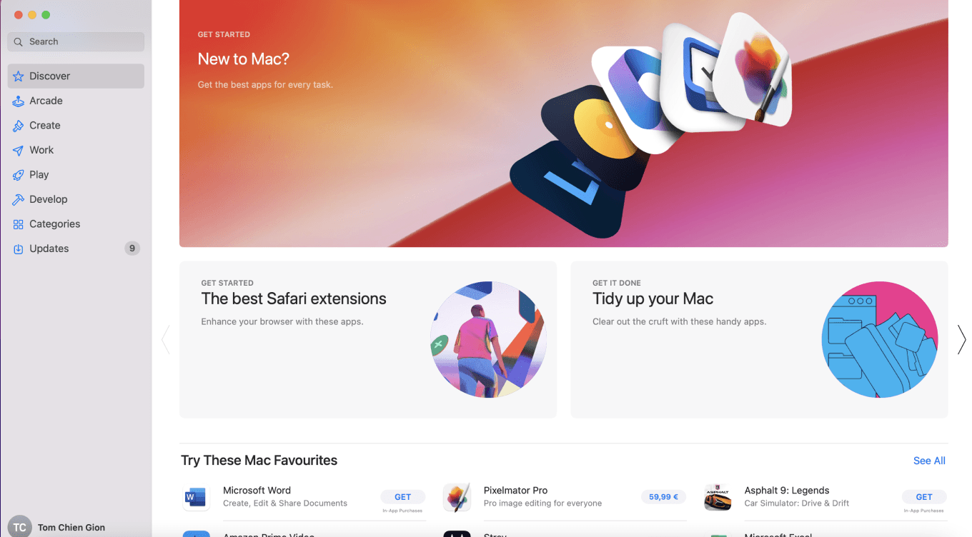
I've carried out some competitor analyses, which have helped me to gain valuable insights into how they build a dashboard and structure its layout. This information has been instrumental in informing my own strategies and refining my approach.
I've carried out some competitor analyses, which have helped me to gain valuable insights into how they build a dashboard and structure its layout. This information has been instrumental in informing my own strategies and refining my approach.
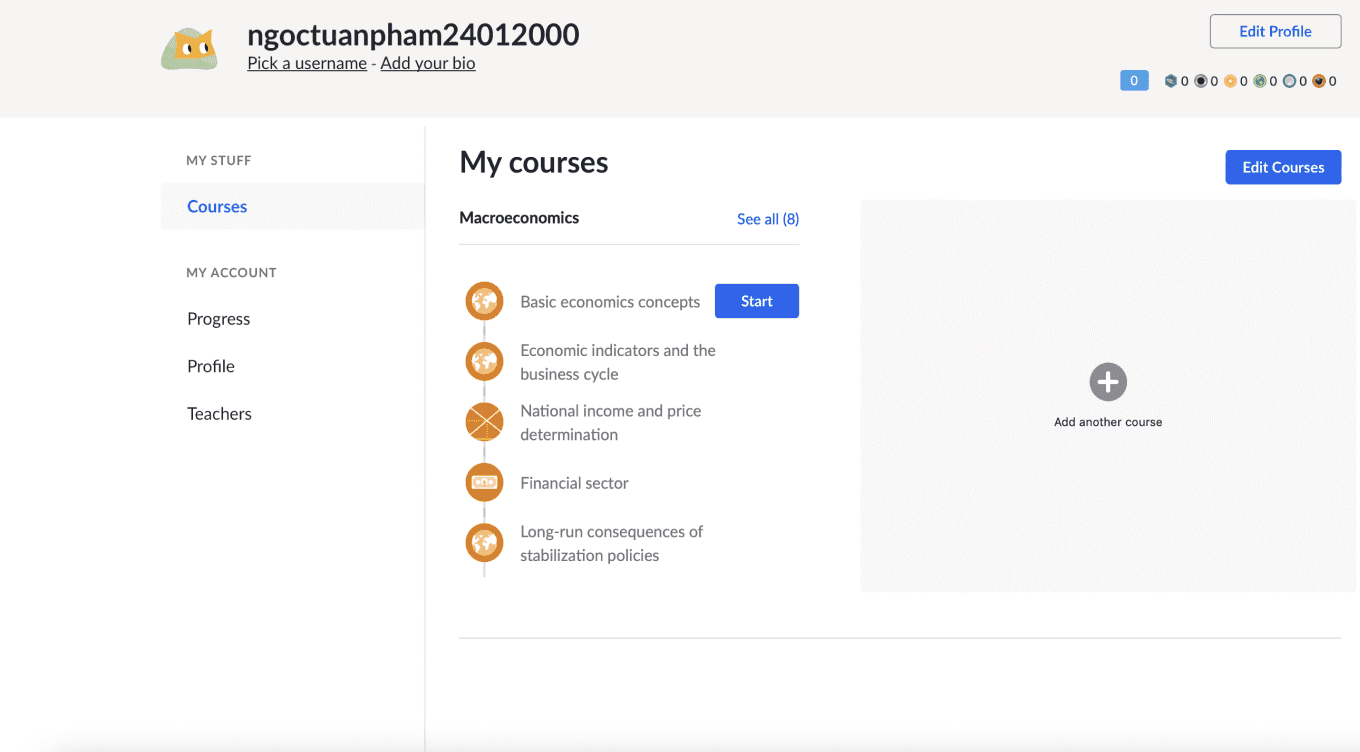
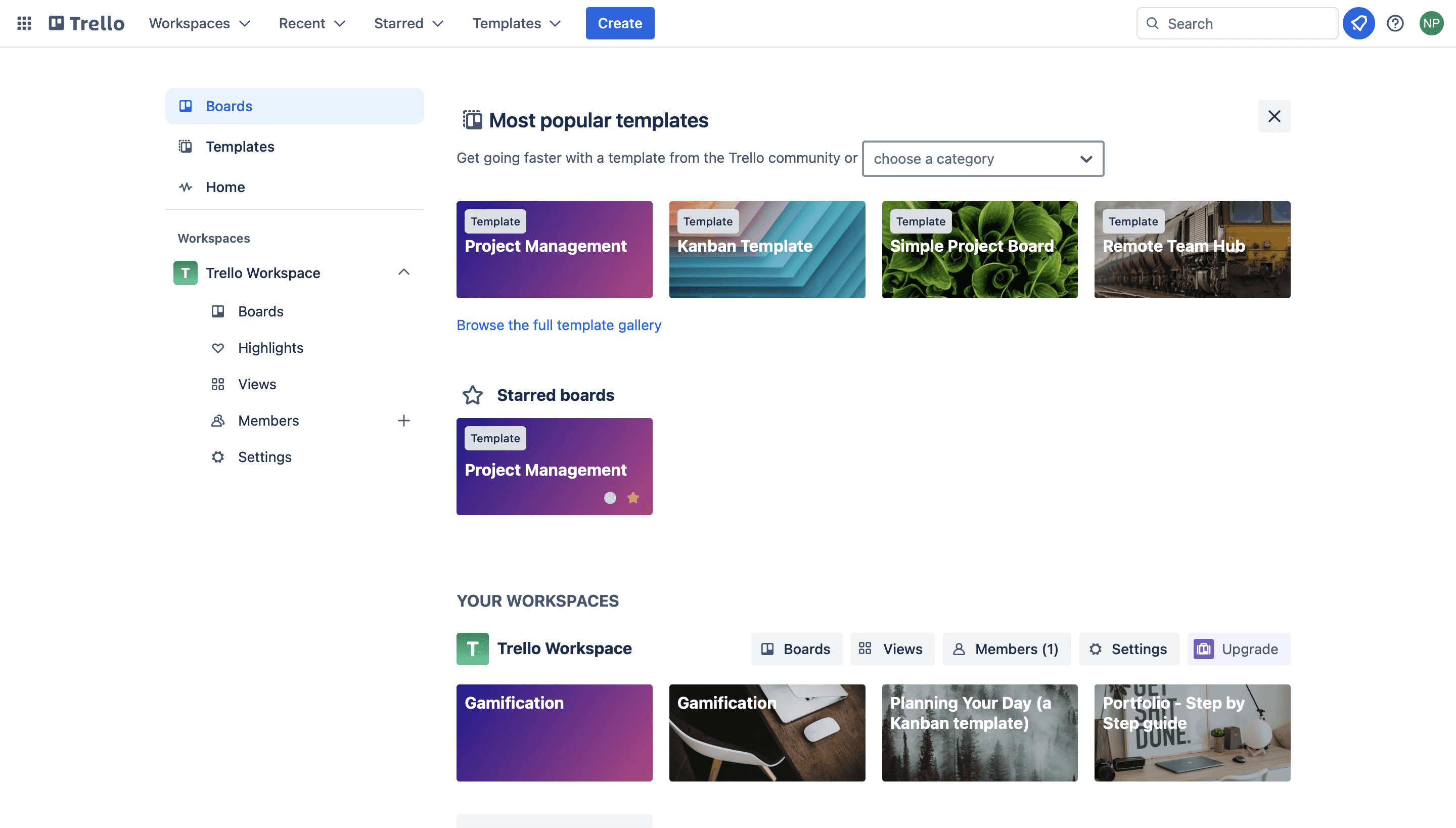
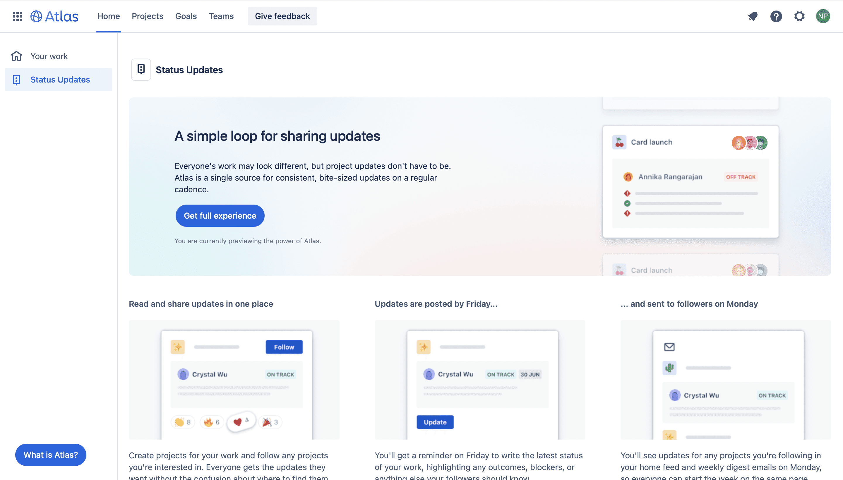
Here are my findings:
Having Sidebars
Having Sidebars
Sidebars house navigation menus, making it easier for users to find what they're looking for on a website or app. They provide a consistent and familiar location for accessing different sections or functionalities.
Sidebars house navigation menus, making it easier for users to find what they're looking for on a website or app. They provide a consistent and familiar location for accessing different sections or functionalities.
Sidebars house navigation menus, making it easier for users to find what they're looking for on a website or app. They provide a consistent and familiar location for accessing different sections or functionalities.
Clear Categories
Clear Categories
Each category should be distinct and not overlap with others. Users shouldn't be confused about which category their desired item belongs to.
Each category should be distinct and not overlap with others. Users shouldn't be confused about which category their desired item belongs to.
Each category should be distinct and not overlap with others. Users shouldn't be confused about which category their desired item belongs to.
Using Modular Blocks
Using Modular Blocks
Modular blocks help to ensure that user interfaces have a consistent look and feel throughout a website or application
Modular blocks help to ensure that user interfaces have a consistent look and feel throughout a website or application
Modular blocks help to ensure that user interfaces have a consistent look and feel throughout a website or application
Information Architecture
Information Architecture
Information Architecture
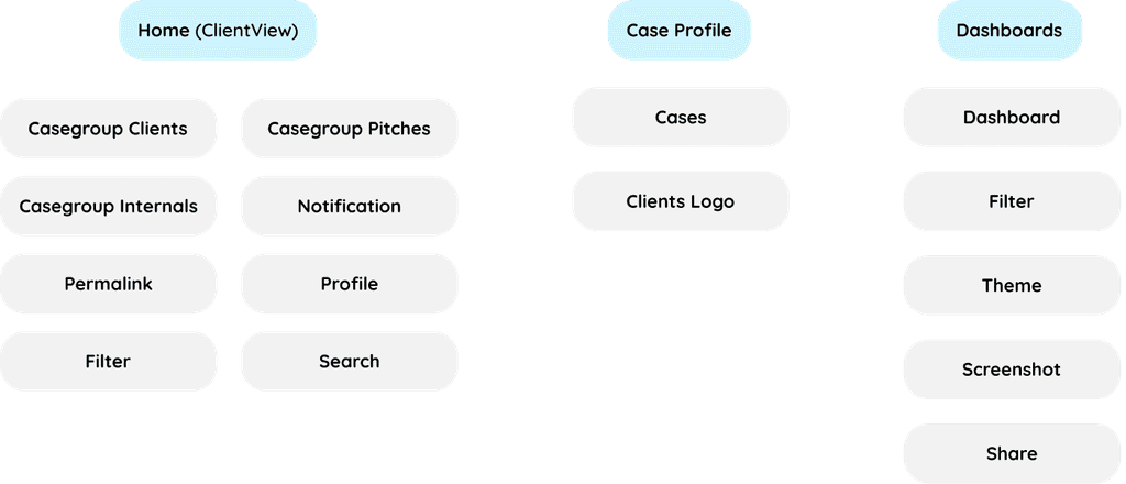
On the main screen, users can view information about Casegroups, each of which contains many cases from clients. This information will be visible on the next screen. Additionally, users can switch between dark mode and User mode, search for Casegroups and cases, filter information using filters, and view profiles.
Within a case, users can view cases from a Casegroup, including products from dentsu such as CAS, Competitive Strike, E-Commerce, Campaign Control, and customize profiles as desired.
Finally, on the dashboard, users can view dashboards, customize them, change themes, and take screenshots, as well as share them.
On the main screen, users can view information about Casegroups, each of which contains many cases from clients. This information will be visible on the next screen. Additionally, users can switch between Dark mode and User mode, search for Casegroups and cases, filter information using filters, and view profiles.
Within a case, users can view cases from a Casegroup, including products from dentsu such as CAS, Competitive Strike, E-Commerce, Campaign Control, and customize profiles as desired.
Finally, on the dashboard, users can view dashboards, customize them, change themes, and take screenshots, as well as share them.


Long
Story Short
Long
Story Short
Long Story Short
Both old hands and newcomers alike grapple with Eagle's user-unfriendly interface and convoluted workflow, making navigation a daunting challenge.
Both old hands and newcomers alike grapple with Eagle's user-unfriendly interface and convoluted workflow, making navigation a daunting challenge.
Both old hands and newcomers alike grapple with Eagle's user-unfriendly interface and convoluted workflow, making navigation a daunting challenge.
How might we streamline Eagle's user interface and simplify its workflow to enhance user navigation and usability?
Redesign Goals
Redesign Goals
Redesign Goals
Enhancing User Experience and Functionality Design goals help me stay focused on what needs to be achieved throughout the design process, preventing distractions and ensuring that your efforts are directed towards meaningful outcomes.
By clearly defining my goals, I can ensure alignment with stakeholders, clients fostering collaboration and shared understanding of project objectives.
Enhancing User Experience
and Functionality Design goals help me stay focused on what needs to be achieved throughout the design process, preventing distractions and ensuring that your efforts are directed towards meaningful outcomes.
By clearly defining my goals, I can ensure alignment with stakeholders, clients fostering collaboration and shared understanding of project objectives.
the dashboard must be intuitive and easy to navigate, allowing users to access information quickly and efficiently.
the dashboard must be intuitive and easy to navigate, allowing users to access information quickly and efficiently
The dashboard's layout and navigation flow smoothly from one section to another, guiding users through their desired tasks or workflows in a logical and intuitive manner.
The dashboard's layout and navigation flow smoothly from one section to another, guiding users through their desired tasks or workflows in a logical and intuitive manner
Designing the dashboard to be scalable, allowing it to accommodate future growth in data volume or user requirements without sacrificing performance or usability.
Designing a scalable dashboard involves ensuring it can handle growing data volumes and changing user needs without sacrificing performance or usability. It's about building flexibility into its framework to seamlessly adapt to future demands while maintaining optimal functionality and user experience
From
User Painpoints to
Design Solutions
From
User Painpoints to
Design Solutions
From
User Painpoints to
Design Solutions
Restructure homepage
Restructure homepage
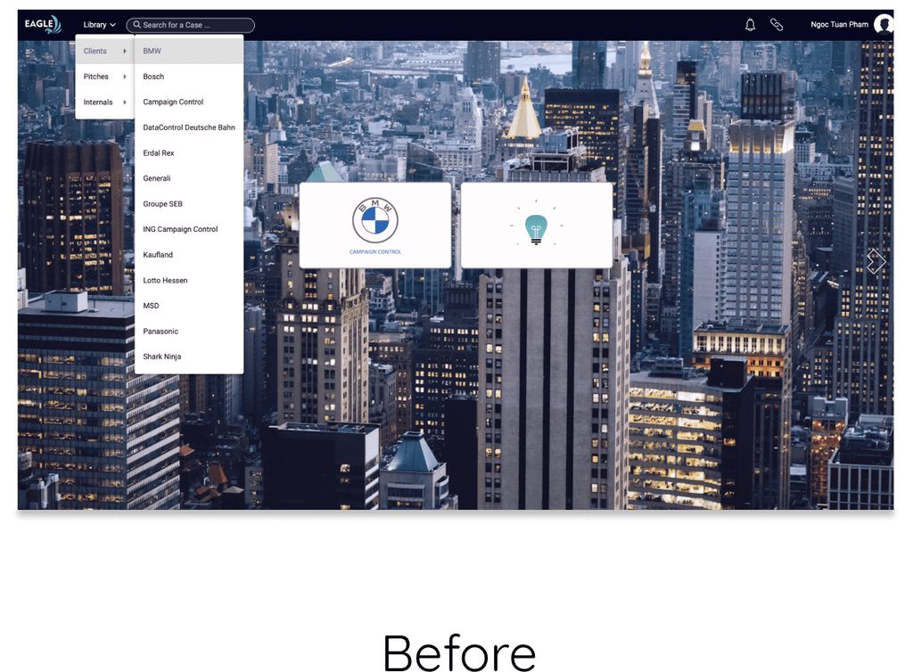


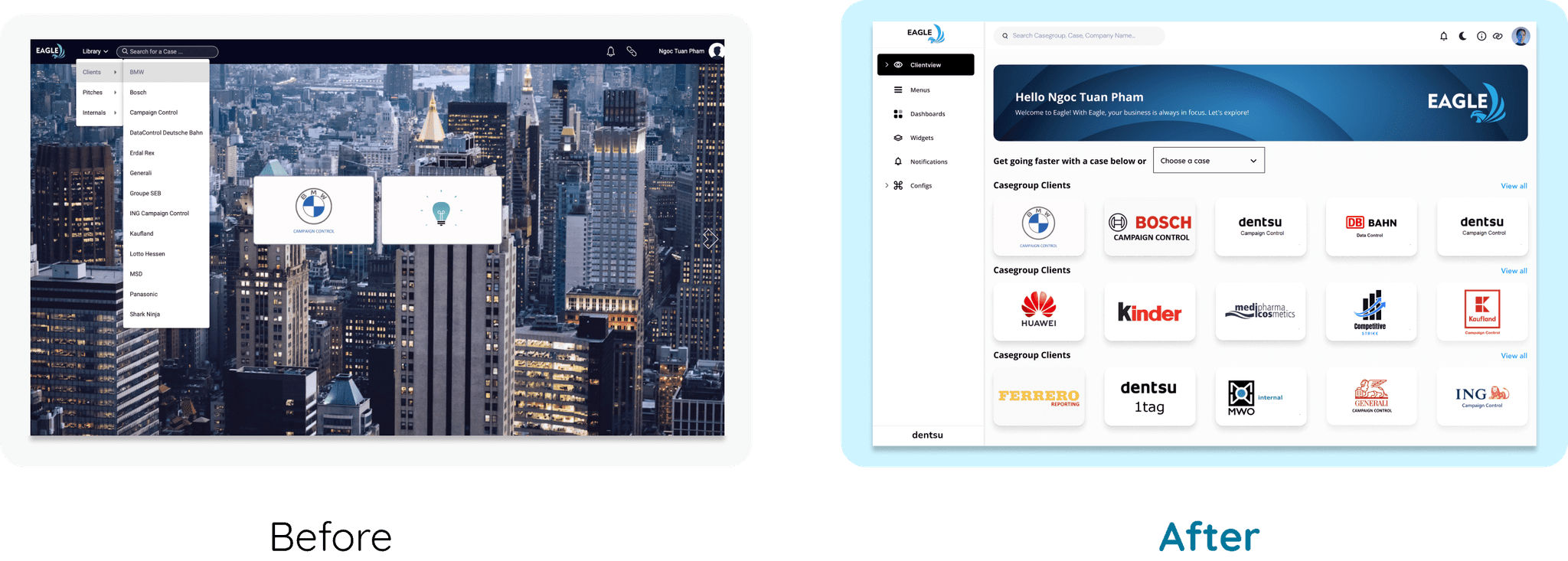
Problem - Before
Problem - Before
Users don’t know what to do with the first screen.
The case that appears on the first screen is too biased, because it may be not what the users are aiming for.
The main section is hidden from the screen.
There is no clear instructions for users to navigate.
The background is not relevant.
Users don’t know what to do with the first screen.
The case that appears on the first screen is too biased, because it may be not what the users are aiming for.
The main section is hidden from the screen.
There is no clear instructions for users to navigate.
The background is not relevant.
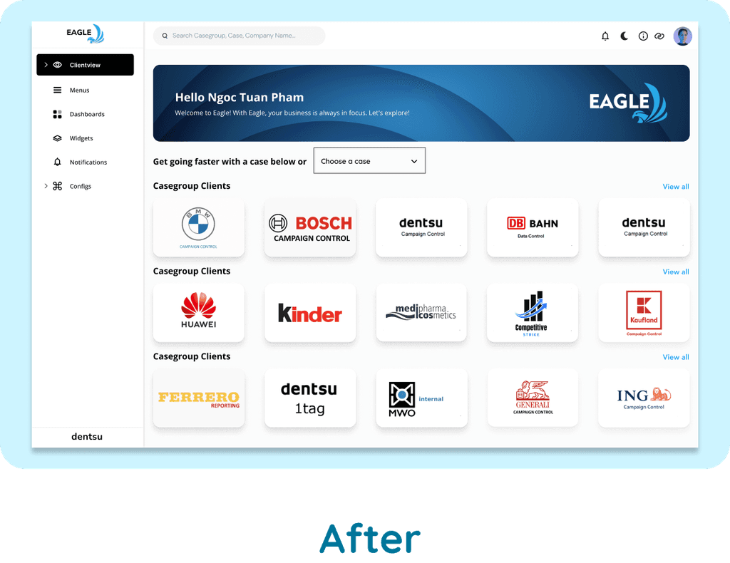


Solution - After
Solution - After
Simplify the onboarding experience by offering clear instructions (including a filter) to assist users in comprehending the purpose of the app or platform and navigating it seamlessly.
The main section or primary content is prominently displayed on the first screen, making it easily accessible and visible to users upon opening platform.
The sidebar provides a persistent navigation menu that allows users to easily access different sections and features of the platform without having to navigate through multiple screens.
Content displayed on the first screen is relevant to the user's needs and preferences.


Optimise Case Profile for Clients
Optimise Case Profile for Clients
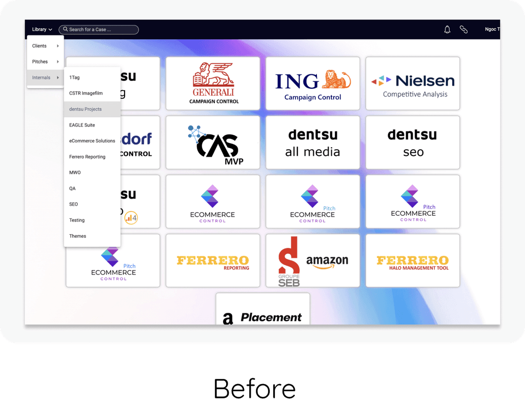


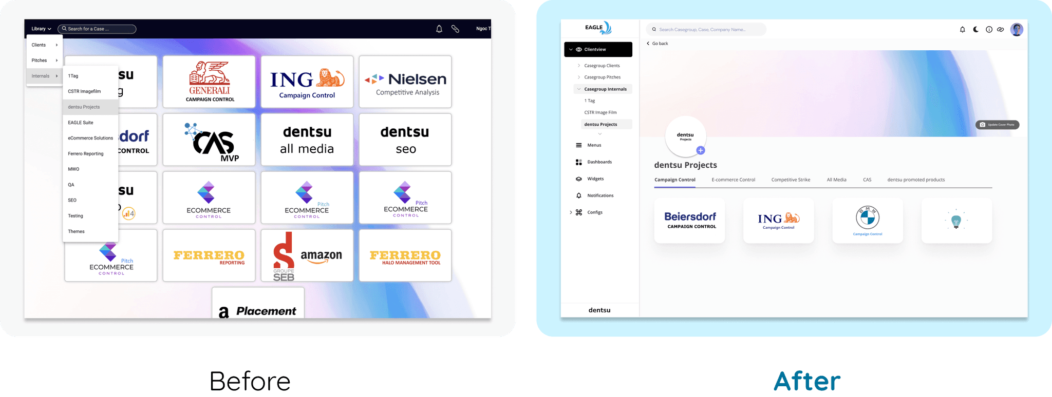
Problem - Before
Problem - Before
Information / Cases are not categorized into groups
There is no ‘’back button’’ for navigation.
The group ‘’dentsu promoted products’’ was hidden. We have to scroll down if we want to see it.
Information / Cases are not categorized into groups
There is no ‘’back button’’ for navigation.
The group ‘’dentsu promoted products’’ was hidden. We have to scroll down if we want to see it.
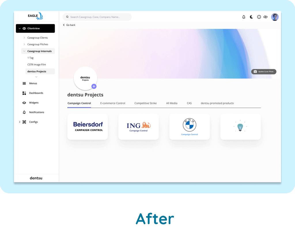


Solution - After
Solution - After
Information Architecture: Content is organized in a logical and intuitive manner.
This includes grouping related features together and providing clear pathways for users to navigate through the app.
Users can edit clients' cover photos and change avatar photos directly in the interface without having to navigate to other screens.
The interface is clean and responsive to future changes or additional cases.
Add a ‘’back button’’ to navigate to the prvious screens’’
Customize the dashboard for data visualization
Because of the NDA and data privacy, I'm unable to share the final screen here. If you're interested in learning more about this project, feel free to contact me.
Customize the dashboard for data visualization
Because of the NDA and data privacy, I'm unable to share the final screen here. If you're interested in learning more about this project, feel free to contact me.
Impact
Impact
Impact
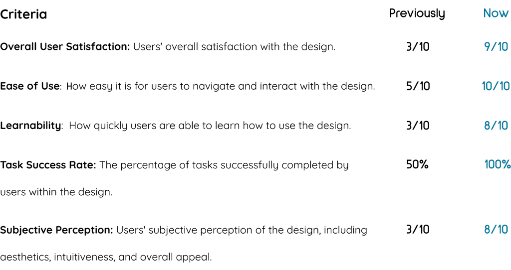
During the usability testing sessions, I was able to identify areas for improvement and observe the differences between two versions. The tests were conducted using a scale from 1 to 10.
During the usability testing sessions, I was able to identify areas for improvement and observe the differences between two versions. The tests were conducted using a scale from 1 to 10.
During the usability testing sessions, I was able to identify areas for improvement and observe the differences between two versions. The tests were conducted using a scale from 1 to 10.


Next step
Next step
Next step
Since the project has not yet been launched, my plan is to continue conducting user usability testing to gain further insights into users' interactions with the dashboard. Additionally, I will present my ideas to Frank (my team manager) and Susanne (the product owner) to discuss the possibility of launching the design. This will involve collaborating with developers to implement any necessary changes or enhancements.
Furthermore, I intend to develop a mobile version of the product, as it is crucial for users to access the dashboard while on the go, particularly during meetings and pitches. Launching a mobile version will enhance accessibility and usability, further maximizing the benefits of the dashboard for users.
